Hover Card
A hover card responds to the cursor with a coordinated motion, a tilt toward the pointer, a lift, a content shift, or a 3D flip, so the card feels physical under the mouse. The effect signals interactivity and rewards exploration. Built with GSAP quickTo for cursor tracking and transforms for the lift or tilt.
- Solved by
- 3 Annnimate components
- Pairs with
- Magnetic ButtonSticky Cursor
Updated June 2, 2026

Components that solve this
 3D Card FlipA card that tilts and turns in 3D as you move your cursor over it, so it looks like it has real depth.
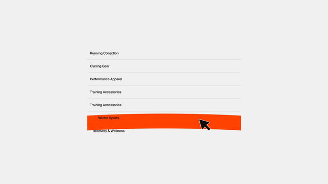 Hoverable ListList rows that fill with a soft curved shape that bends based on whether your cursor came in from the top or the bottom.
 Image Follow ListHover a list item and its image appears and follows your cursor, sliding smoothly as you move between rows.
Tuning the pattern
- Motion type
- A small tilt-toward-cursor or a quiet row-lift (Hoverable List) reads as premium and restrained; a 3D flip to a back face (3D Card Flip) or a cursor-tracked preview image (Image Follow List) reads as playful and exploratory, so save the flip for content that genuinely has two sides and the floating preview for nav lists where the destination deserves a peek.
- Tilt intensity
- 3D Card Flip defaults `max-tilt` to 15 degrees (range 5 to 30) on a `perspective` of 500; 8 to 12 degrees is the tactile sweet spot, past about 15 the card stops reacting and starts spinning, and the larger the card the less tilt it needs, so drop toward 5 to 8 degrees on big tiles.
- Return ease
- Ease back to rest over 0.4 to 0.6s (3D Card Flip `duration` 0.6, Hoverable List 0.5 with `power3.out`); an instant snap on mouseleave feels jarring, while a soft `expo.out` or `power3.out` settle reads considered, so reserve a bouncy `back.out` return for deliberately playful surfaces.
When a hover card fits
Hover cards reward exploration in a grid or list. They work when each item is worth a closer look and the cursor naturally rests on them.
- Feature grids where each card opens a different idea
- Portfolio or case-study tiles
- Pricing tiers that should feel selectable
- Navigation lists where hovering should preview the destination
Touch has no hover
The whole pattern depends on a cursor. On touch devices the effect never fires, so the card must look complete and tappable at rest. Never hide essential information behind a hover-only state.
How the hover responds
The most tactile version maps cursor position within the card to a rotation around X and Y. The card tilts toward the pointer. gsap.quickTo keeps the per-mousemove updates cheap, and a mouseleave handler eases everything back to rest.
script.js
Annnimate components that solve this pattern
- The 3D Card Flip flips a card to reveal a back face on hover, with proper perspective and backface handling
- The Hoverable List shifts and highlights list rows as the cursor moves between them
- The Image Follow List floats a preview image that tracks the cursor as it moves over list items
Common questions
- Why does my card tilt feel laggy?
- You're probably creating a fresh
gsap.toon every mousemove. Usegsap.quickToinstead - it reuses one tween instance and updates the target value per event, which kills the garbage-collection pressure that causes the lag at 60+ events per second. - How much tilt is too much?
- Past about 15 degrees the card stops feeling like it's reacting and starts feeling like it's spinning. 8-12 degrees is the tactile sweet spot for most cards. The larger the card, the less tilt it needs to read as responsive.
- Do hover cards work for keyboard users?
- The tilt is cursor-driven, so keyboard users won't see it - that's fine as long as the card has a clear
:focus-visiblestate and all its content is reachable without hover. The motion is an enhancement, not a requirement.