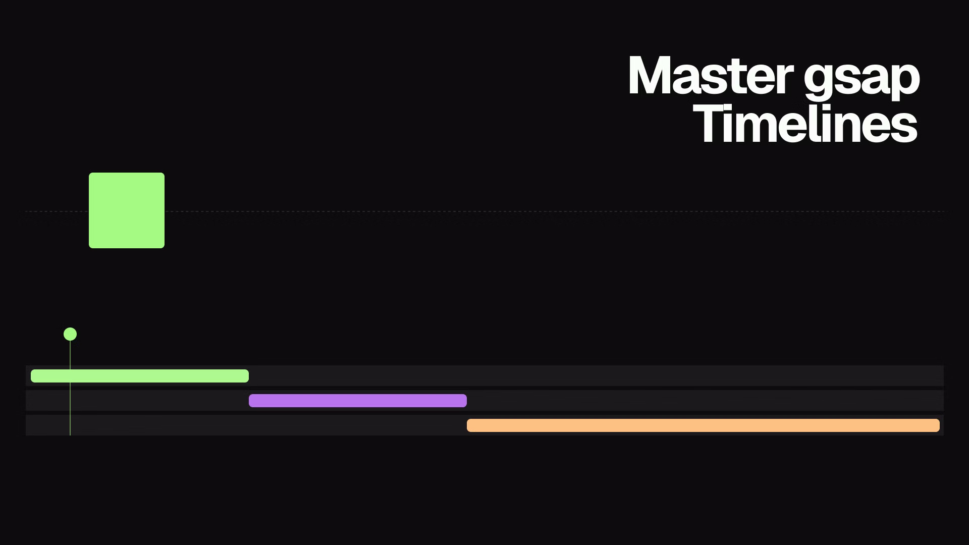
GSAP Stagger: Animate Lists and Grids with Rhythm (2026)
Learn how to use GSAP stagger to animate multiple elements with perfect timing. Covers basic stagger, advanced object syntax, from options, and real-world grid reveals.

Estimated reading time: 8 minutes | Skill level: Beginner to Intermediate
When I animate a list of cards without stagger, it looks wrong. All six cards appear at the same time, like a wall just dropped. The moment I add a stagger, the same animation feels intentional. Each card enters with a slight offset and the whole thing reads as a designed sequence.
Stagger is one of the most impactful things you can add to any list or grid animation. GSAP makes it extremely flexible.
The Basics
The simplest form: a number representing the seconds between each element's animation start.
gsap.from(".card", {
  y: 30,
  opacity: 0,
  duration: 0.6,
  ease: "power3.out",
  stagger: 0.1  // each card starts 0.1s after the previous
});
.cardThis single property transforms a flat entrance into a flowing reveal.
Visual: PLACEHOLDER - Side-by-side of 6 cards appearing without stagger vs with stagger: 0.1
Stagger with a Timeline
Inside a timeline, stagger works exactly the same way. The staggered sequence becomes one step in a larger choreography:
const tl = gsap.timeline({
  scrollTrigger: {
    trigger: ".grid",
    start: "top 80%",
    once: true
  }
});

tl.from(".section-title", { y: 20, opacity: 0, duration: 0.7 });

tl.from(".card", {
  y: 30,
  opacity: 0,
  duration: 0.6,
  ease: "power3.out",
  stagger: 0.1
}, "-=0.3");
The title animates first. Then the cards cascade in, overlapping the title by 0.3 seconds. The whole section feels like one connected motion.
The Stagger Object
For more control, pass an object instead of a number.
amount vs each
There are two ways to define stagger timing:
// each: fixed offset between items (0.1s per item regardless of count)
stagger: { each: 0.1 }

// amount: total stagger duration distributed across all items
stagger: { amount: 0.6 }  // 6 items = 0.1s each; 12 items = 0.05s each
eachamountfrom
Thefromstagger: { each: 0.08, from: "start" } // left to right (default)
stagger: { each: 0.08, from: "end" } // right to left
stagger: { each: 0.08, from: "center" } // outward from center
stagger: { each: 0.08, from: "edges" } // inward from edges to center
stagger: { each: 0.08, from: "random" } // randomized order
Random stagger is particularly effective for organic-looking reveals:
gsap.from(".card", {
  y: 20,
  opacity: 0,
  duration: 0.5,
  stagger: {
    each: 0.07,
    from: "random"
  }
});
Elements animate in a scattered order instead of a predictable sequence. Good for grids where the diagonal left-to-right pattern would feel too mechanical.
Visual: PLACEHOLDER - Grid of cards showing 5 different stagger directions: start, end, center, edges, random
Grid-Aware Stagger
For two-dimensional grids, GSAP can calculate stagger based on grid position rather than DOM order. Pass the grid dimensions and GSAP treats the elements as rows and columns:
gsap.from(".card", {
  y: 30,
  opacity: 0,
  duration: 0.6,
  stagger: {
    each: 0.05,
    from: "center",
    grid: [3, 4]  // 3 rows, 4 columns
  }
});
from: "center"grid: [3, 4]grid: "auto"stagger: {
each: 0.05,
from: "start",
grid: "auto"
}
This works when your grid items are laid out with CSS Grid or Flexbox and the columns are consistent. GSAP reads the rendered positions.
Function-Based Stagger
For completely custom timing, pass a function. GSAP calls it once per element with the index, element, and full targets array:
gsap.from(".item", {
  y: 20,
  opacity: 0,
  duration: 0.5,
  stagger: (index) => index * 0.08 + Math.random() * 0.05
});
This produces a base stagger of 0.08s per item with a small random offset added. The result is natural without being chaotic.
A more practical use: different delays based on element type:
gsap.from(".cell", {
  opacity: 0,
  scale: 0.9,
  duration: 0.4,
  stagger: (index, target) => {
    // Featured cells animate first
    return target.classList.contains("featured") ? 0 : (index * 0.06) + 0.3;
  }
});
Practical Examples
Feature Card Grid
A typical use case: animating a row of feature cards when they enter the viewport.
function animateFeatureCards() {
  const cards = document.querySelectorAll(".feature-card");

  gsap.from(cards, {
    y: 40,
    opacity: 0,
    duration: 0.7,
    ease: "power3.out",
    stagger: {
      each: 0.1,
      from: "start"
    },
    scrollTrigger: {
      trigger: ".feature-grid",
      start: "top 75%",
      once: true
    }
  });
}
Navigation Links
Stagger works well for menu items that animate in on page load or menu open:
function animateNavLinks() {
  gsap.from(".nav-link", {
    y: -10,
    opacity: 0,
    duration: 0.4,
    ease: "power2.out",
    stagger: 0.06
  });
}
The offset is small (0.06s) because navigation items are close together. Too much stagger on short distances looks slow and disconnected.
List Items with Scroll Trigger
Long lists that reveal as you scroll:
gsap.from(".list-item", {
  x: -20,
  opacity: 0,
  duration: 0.5,
  ease: "power2.out",
  stagger: {
    amount: 0.8,  // total 0.8s for all items however many there are
    from: "start"
  },
  scrollTrigger: {
    trigger: ".list",
    start: "top 80%",
    once: true
  }
});
amountStagger with Repeat and Yoyo
Stagger also works on repeated animations. Each element loops with its own offset:
gsap.to(".dot", {
  y: -15,
  duration: 0.4,
  ease: "power2.out",
  repeat: -1,
  yoyo: true,
  stagger: {
    each: 0.1,
    from: "start",
    repeat: -1
  }
});
stagger.repeat: -1Performance Note
When animating many elements with stagger, animateopacitytransformxyscalerotationwidthheighttopleftmarginFor very long lists (50+ items), consider animating only elements that are currently visible instead of staggering the entire list at once.
Common Mistakes
Stagger that's too large. A stagger of 0.5s on a 10-item grid means the last card doesn't animate for 4.5 seconds. Keep stagger values small: 0.05 to 0.15 seconds works for most use cases.
Forgetting once: true
delaywidthheighttopleftKey Takeaways
- offsets each element by 0.1 seconds. Simple and effective.
stagger: 0.1 - The object syntax gives you ,
each,amount, andfromcontrols.grid - creates organic-looking reveals for grids.
from: "random" - or
grid: "auto"enables 2D ripple patterns.grid: [rows, cols] - Function-based stagger gives you complete custom timing per element.
- Keep stagger values small (0.05 to 0.15s) and animate transforms only.
Take It Further
Stagger becomes even more powerful inside timelines. The GSAP Timeline Tutorial covers how to sequence staggered groups as part of larger choreography.
For scroll-triggered stagger, GSAP ScrollTrigger Examples has working examples with batch triggers for improved performance on long pages.
Browse the Annnimate library for production-ready animations that use these stagger patterns. Every animation includes the full GSAP code.
Written by
Julian Fella
Founder
Related reading
GSAP Timeline Tutorial: Sequence Animations Like a Pro (2026)
Learn how to use gsap.timeline() to sequence animations with precision. Covers the position parameter, defaults, labels, playback control, and real-world examples.
GSAP ScrollTrigger Examples: 10 Scroll Animations You Can Use Today
Ten production-ready GSAP ScrollTrigger patterns: fade reveals, parallax, text effects, SVG drawing, mask reveals, and flip animations. Copy-paste code for each.

GSAP Text Animation: A Practical SplitText Guide (2026)
How to animate text with GSAP SplitText. Covers chars, words, and lines with scroll-triggered reveals, stagger, and mask effects. Copy-paste examples included.