GSAP ScrollTrigger Examples: 10 Scroll Animations You Can Use Today
Ten production-ready GSAP ScrollTrigger patterns: fade reveals, parallax, text effects, SVG drawing, mask reveals, and flip animations. Copy-paste code for each.
Estimated reading time: 12 minutes | Skill level: Beginner to Intermediate
ScrollTrigger is the reason GSAP stays relevant when every framework ships its own animation primitives. It's not just a scroll listener — it's a full choreography system. Scrub, pin, batch, snap, refresh — the API covers cases that would take hundreds of lines in raw JavaScript.
This post covers ten patterns you'll actually use. Not demos. Not proof-of-concept toys. Patterns that show up in client work, portfolio sites, and product pages regularly.
Each example includes the core code and a link to a pre-built version in Annnimate if you want the complete implementation with all variants.
Setup
Before anything works, you need ScrollTrigger registered:
import { gsap } from "gsap";
import { ScrollTrigger } from "gsap/ScrollTrigger";

gsap.registerPlugin(ScrollTrigger);
If you're using a CDN:
<script src="https://cdn.jsdelivr.net/npm/gsap@3/dist/gsap.min.js"></script>
<script src="https://cdn.jsdelivr.net/npm/gsap@3/dist/ScrollTrigger.min.js"></script>
Register the plugin once, at app startup. Registering it inside components or functions that run multiple times causes issues.
1. Element Reveal on Scroll
The most common ScrollTrigger pattern. Elements fade and slide into view as you scroll past them.
gsap.from(".card", {
  scrollTrigger: {
    trigger: ".card",
    start: "top 85%",
    toggleActions: "play none none none"
  },
  opacity: 0,
  y: 40,
  duration: 0.8,
  ease: "expo.out"
});
gsap.utils.toArraygsap.from(gsap.utils.toArray(".card"), {
scrollTrigger: {
trigger: ".cards-grid",
start: "top 80%",
},
opacity: 0,
y: 40,
duration: 0.8,
ease: "expo.out",
stagger: 0.1
});
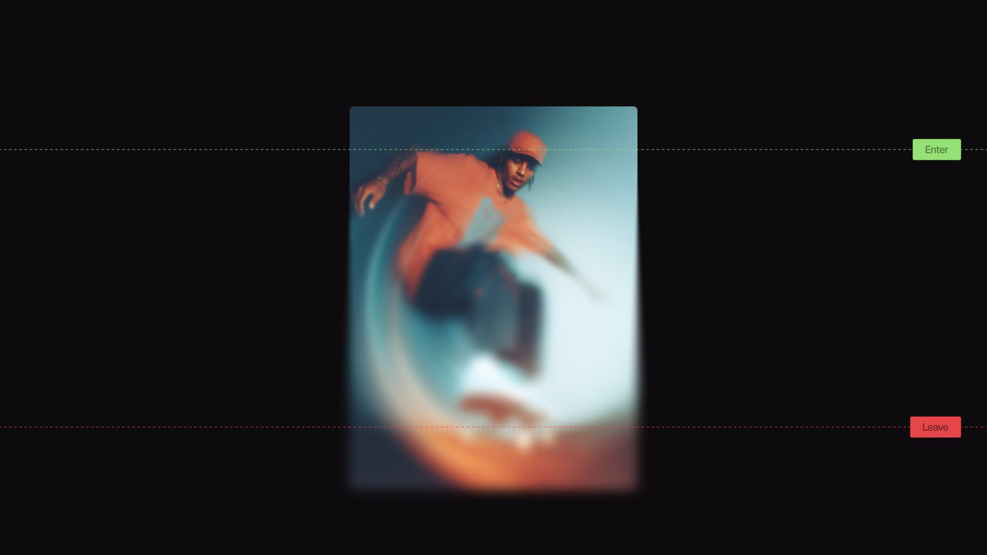
start: "top 85%"For a production-ready version with six reveal variants (fade, slide, scale, clip path, blur fade, rotate), see the Element Reveal animation.
2. Text Reveal by Lines
RawopacityyPercent: 100import { SplitText } from "gsap/SplitText";
gsap.registerPlugin(SplitText);
const split = SplitText.create(".headline", { type: "lines", mask: "lines" });
gsap.from(split.lines, {
scrollTrigger: {
trigger: ".headline",
start: "top 80%"
},
yPercent: 100,
opacity: 0,
duration: 1,
ease: "expo.out",
stagger: 0.08
});
mask: "lines"For the complete implementation with scroll scrub mode and accessibility considerations, see Text Reveal.
3. Parallax Depth Effect
Parallax is the effect where background elements move slower than the page, creating an illusion of depth. Overused when done obviously, invisible when done subtly.
gsap.to(".background-layer", {
  scrollTrigger: {
    trigger: ".section",
    start: "top bottom",
    end: "bottom top",
    scrub: true
  },
  y: -100
});

gsap.to(".foreground-element", {
  scrollTrigger: {
    trigger: ".section",
    start: "top bottom",
    end: "bottom top",
    scrub: true
  },
  y: -200
});
scrub: truescrub: 1-80px-120px-150px-200pxSee the Parallax animation for a full implementation with configurable speed layers.
4. Scroll-Scrubbed Mask Reveal
Instead of fading in, content appears through an expanding shape — a circle, rectangle, or custom clip path — directly tied to scroll progress.
gsap.from(".image-container", {
  scrollTrigger: {
    trigger: ".reveal-section",
    start: "top center",
    end: "bottom center",
    scrub: 1
  },
  clipPath: "circle(0% at 50% 50%)",
  ease: "none"
});

// End state
gsap.to(".image-container", {
  clipPath: "circle(100% at 50% 50%)"
});
fromTogsap.fromTo(".image-container",
{ clipPath: "circle(0% at 50% 50%)" },
{
clipPath: "circle(75% at 50% 50%)",
ease: "none",
scrollTrigger: {
trigger: ".reveal-section",
start: "top center",
end: "bottom top",
scrub: 1
}
}
);
The Mask Reveal animation includes circle, oval, rectangle, blob, and custom clip path variants, plus image masks.
5. Pinned Section with Horizontal Scroll
Pin a section vertically while content scrolls horizontally. Common for feature walkthroughs and timeline layouts.
const container = document.querySelector(".horizontal-container");
const slides = gsap.utils.toArray(".slide");

gsap.to(slides, {
  xPercent: -100 * (slides.length - 1),
  ease: "none",
  scrollTrigger: {
    trigger: container,
    pin: true,
    scrub: 1,
    end: () => "+=" + container.offsetWidth
  }
});
pin: trueend: () => "+=" + container.offsetWidthendOne thing to watch: pinned sections add extra scroll height to the page. Make sure your layout accounts for this, especially when stacking multiple pinned sections.
6. SVG Path Drawing
Animate SVG strokes drawing themselves on scroll. Works with any path element — signatures, illustrations, UI decorations.
import { DrawSVGPlugin } from "gsap/DrawSVGPlugin";

gsap.registerPlugin(DrawSVGPlugin);

gsap.from(".svg-path", {
  scrollTrigger: {
    trigger: ".svg-section",
    start: "top 70%",
    end: "bottom 30%",
    scrub: 1
  },
  drawSVG: "0%"
});
stroke-dasharraystroke-dashoffsetstrokefillFor paths that draw from a specific point rather than the beginning:
gsap.fromTo(".svg-path",
  { drawSVG: "50% 50%" },
  {
    drawSVG: "0% 100%",
    scrollTrigger: { /* ... */ }
  }
);
This draws outward from the center simultaneously in both directions — useful for logo reveals and decorative dividers.
See SVG Draw Path for the complete implementation.
7. Background Color Transition Between Sections
Change background and text colors smoothly as the user scrolls from section to section. Useful for storytelling pages where each section has a distinct mood.
const sections = gsap.utils.toArray(".color-section");

sections.forEach((section) => {
  const bg = section.dataset.bg;
  const color = section.dataset.color;

  ScrollTrigger.create({
    trigger: section,
    start: "top center",
    end: "bottom center",
    onEnter: () => gsap.to("body", { backgroundColor: bg, color: color, duration: 0.6 }),
    onEnterBack: () => gsap.to("body", { backgroundColor: bg, color: color, duration: 0.6 })
  });
});
HTML:
<section class="color-section" data-bg="#0a0a0a" data-color="#fafafa">Dark section</section>
<section class="color-section" data-bg="#fafafa" data-color="#0a0a0a">Light section</section>
onEnterBackThe Background Color animation handles multiple zones with smooth transitions and optional text color changes.
8. Velocity-Based Distortion
Read scroll velocity and distort elements based on how fast the user is scrolling. Fast scroll = more distortion. Slow scroll = elements return to normal.
ScrollTrigger.create({
  onUpdate: (self) => {
    const velocity = self.getVelocity();
    const clampedVelocity = gsap.utils.clamp(-1000, 1000, velocity);
    const skew = gsap.utils.mapRange(-1000, 1000, -10, 10, clampedVelocity);

    gsap.to(".distort-target", {
      skewY: skew,
      duration: 0.5,
      ease: "power3.out",
      overwrite: true
    });
  }
});
self.getVelocity()gsap.utils.mapRangeoverwrite: trueFor clip path-based velocity distortion where elements clip rather than skew, see Velocity Clip.
9. Folding Text Reveal
Characters fold in 3D space as they reveal. Each character rotates on X or Y axis from a folded state to flat, creating a paper-fold effect.
import { SplitText } from "gsap/SplitText";

gsap.registerPlugin(SplitText);

const split = SplitText.create(".fold-text", { type: "chars" });

gsap.from(split.chars, {
  scrollTrigger: {
    trigger: ".fold-text",
    start: "top 80%"
  },
  rotationX: 90,
  transformOrigin: "0% 50% -20px",
  opacity: 0,
  duration: 0.8,
  ease: "expo.out",
  stagger: 0.03
});
transformOrigin: "0% 50% -20px"Perspective on the parent element amplifies the 3D effect:
.fold-text {
  perspective: 400px;
}
See Folding Text for the full implementation with configurable fold direction and stagger patterns.
10. GSAP Flip on Scroll
GSAP Flip records element positions before and after a state change, then animates between them. Combined with ScrollTrigger, elements can smoothly rearrange as you scroll.
import { Flip } from "gsap/Flip";

gsap.registerPlugin(Flip);

ScrollTrigger.create({
  trigger: ".flip-section",
  start: "top center",
  onEnter: () => {
    const state = Flip.getState(".flip-card");

    // Change the layout (add class, move to different container, etc.)
    document.querySelector(".target-container").appendChild(
      document.querySelector(".flip-card")
    );

    Flip.from(state, {
      duration: 0.8,
      ease: "expo.inOut"
    });
  }
});
Flip.getState()For a scroll-scrubbed version where elements move between zones as you scroll, see Flip Zone. For staggered multi-element flip reveals, see Multi Flip.
ScrollTrigger Performance Tips
A few things that cause problems in production:
Refresh on resize. ScrollTrigger calculates positions once. If your layout shifts on resize, callScrollTrigger.refresh()scaleXscaleYUse will-change: transform
invalidateOnRefresh: true
ScrollTrigger.create({
  trigger: ".dynamic-section",
  end: () => "+=" + document.querySelector(".dynamic-section").offsetHeight,
  invalidateOnRefresh: true
});
ScrollTrigger.batch()ScrollTrigger.batch(".card", {
onEnter: (elements) => {
gsap.from(elements, {
opacity: 0,
y: 40,
stagger: 0.1,
duration: 0.8,
ease: "expo.out"
});
}
});
What's Next
These ten patterns cover the majority of scroll animation work. The more complex implementations — scroll-linked 3D transformations, physics-based momentum, WebGL shader effects driven by scroll — build on the same ScrollTrigger foundation.
If you want pre-built, copy-paste versions of all the animations above plus 40+ others, Annnimate has them ready to drop into any project. HTML/CSS/JS and React formats, with live previews and customizable parameters.
Written by
Julian Fella
Founder
Related reading
GSAP Text Animation: A Practical SplitText Guide (2026)
How to animate text with GSAP SplitText. Covers chars, words, and lines with scroll-triggered reveals, stagger, and mask effects. Copy-paste examples included.
GSAP ScrollTrigger Tutorial: Animate on Scroll (2025)
Learn GSAP ScrollTrigger with step-by-step examples. Includes code snippets, performance tips, and ready-to-use scroll animations for your project.
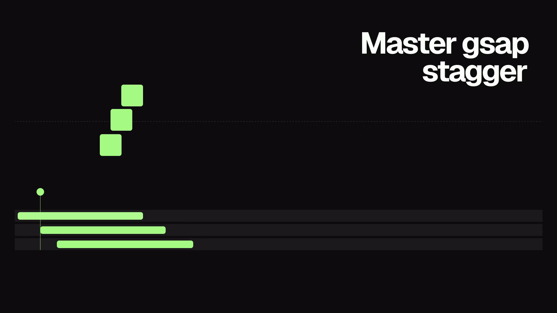
GSAP Stagger: Animate Lists and Grids with Rhythm (2026)
Learn how to use GSAP stagger to animate multiple elements with perfect timing. Covers basic stagger, advanced object syntax, from options, and real-world grid reveals.